A Graphic Novel Preview…
(Written over Cherry Coke and Tobacco at The Pub, Jack Johnson playing in the background)
When I started the revamp/recreation of the old comics for a print edition, I knew that this section was one of the ones that needed to be redone.
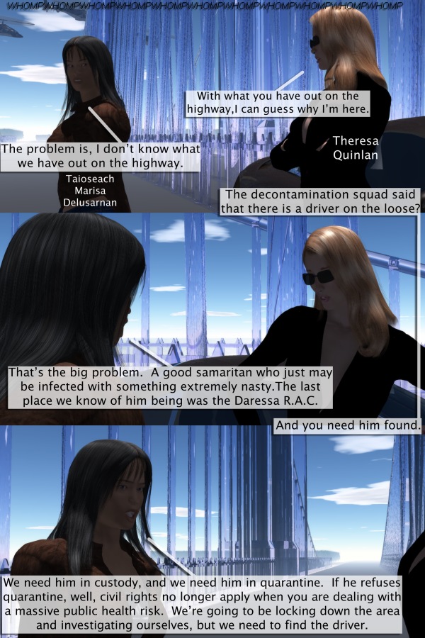
The first appearance of the Owl River Bridge
My problem at the time was that I didn’t know enough about the software that I was using, and I was never able to get quite what I wanted for it. The later version that I did in Carrara (with Ena MacSwain and Clarence Gage) was close, but it was still early, and was the very first strip that I ever did with Carrara.
So when I redid this it was time for logic to apply. A quarantined location has people in hazmat suits; in a sci-fi setting it has robots and power armor. There should be helicopters and vehicles. And a river should have trees and vegetation around it. A bridge should be big. And The Owl River Bridge is a huge structure and is not like what you are used to seeing in this world.
Everything should be big, there should be distance distortion and horizon effects, and there should be a shift in motion with animate objects in the background.
Reflection, I think, is one of the main keys to realism in 3d comics. A lot of us are not traditional artists with a story; we’re writers who are engaged in graphic story telling. A subtle difference, but a difference none the less. Seeing one person talking to another, and seeing the reflection in the eyeglass lenses of the person they are addressing is what helps take it to the next level.
The other key is lighting. In the old days we were dealing with a lighting model that involved putting lights around a spherical structure around characters and figures. It was guesswork for a color blind person like me, and a lot of the early strips suffered for it.
People should look like they are part of a scene, not just rendered over the top of it with a bit of guesswork and trial and error to get the lighting right. That’s the way it was in the early days when we started this strip. A lot of outdoor work was done with Bryce 5.1, and Poser 5. Background were put together using Bryce, brought into Poser 5 and used as backdrops (kind of like blue screen is done) Even when the early versions of DAZ Studio made their appearance (used as a plug-in with Bryce 5.5 to allow you to bring your people into a Bryce scene) lighting from one program to another was still a crap shoot.
Carrara (with the Transposer plug-in) put an end to all of that. For the first time it was really possible to bring people into the environment, have all of their textures and materials look perfect and have them look like they truly belonged there. There were other early attempts at this with other pieces of software. But to my eyes, Carrara was the first one where it started looking real. Nowadays, lighting works within the environment of the program like lighting works in the real world. When you are outside in the day time and the sun is shining on someone from the west, the side of the person that is not facing the sun is not totally submerged in shadow. Lighting in an outdoor setting is global in nature. And inside, if you have a lamp in a scene, you can easily drop a light right on to where the light bulb is and have it interact with the scene (and the lamp shade) the way lights in the real world work. And now that this is possible, the comics should be reflecting this fact. Now when you look at the bridge and the car behind them, you actually see them interacting and reflecting their environment.

The other thing was the look of the characters. Taioseach Delusarnan never looked right to my eyes, and when I went back through the old files for her, and found that several necessary files for her were corrupted, I knew that this was finally my chance to get her right. Quinlan was another one who took a long time to match what I have seen of her in my minds eye. The way she looks in the recent comics (especially the ones where she is interacting with Hakon Blackaxe) is the pretty damn close to my original vision of her. So I decided that she would be reworked as well. Quinlan is not a pretty woman, striking is always the best way I have ever heard her described, and I think I have finally managed to get that right There was also a change in character base geometry with her as well. That was done in order to actually give her a decent wardrobe to wear after long last 
A number of other characters have been reworked a bit as well. The look of Ian Caladharas will finally be unified across the comic, and a number of other people will be getting polished up as well. In addition, a number of other sections of the story will be expanded, with several new sections being added. Right now, I’m working on a new section set at the University of Erech…which will finally be the character introduction that Julia Wells deserves. After that will be a revamped Iyesta Observatory, and the introduction of Taioseach Jessica Tindal and Professors Clarence Gage and E.D.G.A.R.
A lot more back story is being filled in, and we’re taking the opportunity to stretch out a little bit. The approach to this whole project is in a lot of ways similar to what Stephen King took when he finally put together the complete, uncut, version of “The Stand”:
“You won’t find old characters acting in strange new ways, but all of the characters were doing a lot more things, and if I didn’t think they were interesting, or added something to the story, they wouldn’t be in here.”


 Support Me on Ko-fi
Discussion ¬